Method: Quadratic Discriminant Analysis
Types: Supervised Learning - Classifier
Requirement: Training Instances with labels
QDA is a classifier with quadratic decision surface. It performed supervised learning by projecting input data into a quadratic subspace with direction which maximize distances between classes
In this example, we will use ‘digit’ dataset in sklearn as training and test data. For giving simple tutorials to beginners in ML, we will pick digit ‘1’ and ‘7’ only.
import numpy as np
import matplotlib.pyplot as plt
import matplotlib.patches as pat
from matplotlib.colors import ListedColormap
from sklearn.datasets import load_digits
from sklearn import cross_validation

# 1. Data Preparation

digits = load_digits()                          # Load digit dataset
data = digits['data']
images = digits["images"]
target = digits["target"]

num1, num2 = 1,7                              # Data filtering
mask = np.logical_or(target == num1, target == num2)
filtered_data = data[mask]
filtered_target = target[mask]

filtered_target[filtered_target == num1] = 0   # Relabel targets
filtered_target[filtered_target == num2] = 1

print "Filtered dataset has {} instances.".format(len(filtered_target))
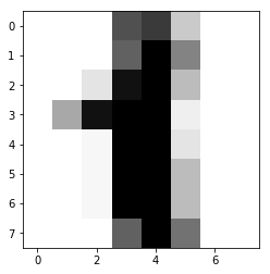
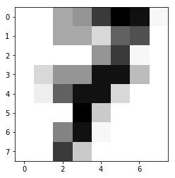
In this example, we try to distinguish ‘1’ and ‘7’ from the dataset:
To perform dimension reduction, we start with hand-crafted method first. Advanced dimension reduction techniques (Linear Regression, Ridge Regression with Regularization…etc will be shown in other chapters.
# 2. Dimension Reduction

def reduce_dim(x):

    instance_num = np.shape(x)[0]
    reduced_x = np.zeros((instance_num, 2), dtype = "float64")

    imgn1 = filtered_data[filtered_target == 0, :]
    imgn2 = filtered_data[filtered_target == 1, :]

    imgn1 = np.mean(imgn1, axis = 0)
    imgn2 = np.mean(imgn2, axis = 0)

    img_diff = np.reshape(imgn1 - imgn2, (8, 8))

    # If you want to visualize the result, uncomment the following lines:
    # plt.figure()
    # plt.imshow(img_diff, interpolation = "nearest")
    # plt.figure()
    # plt.imshow(images[num1]-images[num2], interpolation = "nearest")
    # plt.show()

    feature_1 = 1*x[:,12] + 4*x[:,19] +1*x[:,44]+5*x[:,52]+5*x[:,60]
    feature_2 = 2*x[:,5] + 5*x[:,6] +3*x[:,14]+2*x[:,50]+3*x[:,58]

    reduced_x = np.asarray([feature_1, feature_2]).T
    return reduced_x

reduced_data = reduce_dim(filtered_data)
print 'The shape of x before reduction = {}.\n'.format(np.shape(filtered_data))
print 'The shape of x after reduction = {}.\n'.format(np.shape(reduced_data))
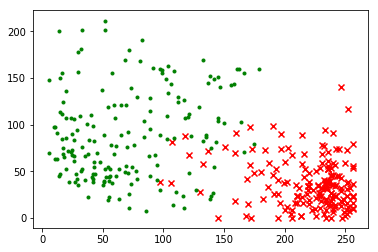
Digit data after dimension reduction:
# 3. Data Visualization
plt.figure()
reduced_n1 = reduced_data[filtered_target == 0]
reduced_n2 = reduced_data[filtered_target == 1]
plt.scatter(reduced_n1[:, 0], reduced_n1[:, 1], color = 'red', marker = 'x')
plt.scatter(reduced_n2[:, 0], reduced_n2[:, 1], color = 'green', marker = '.')
plt.show()
Then we start training the classifier with training instances and labels
# 4. Filtered dataset spliting

X_train, X_test, y_train, y_test = cross_validation.train_test_split(reduced_data, filtered_target, test_size = 0.4, random_state = 0)
# print np.shape(X_train), np.shape(X_test), np.shape(y_train), np.shape(y_test)

# 5. QDA Training and Testing Function:

def fit_qda(tr_features, tr_labels):

    fea_0 = tr_features[tr_labels == 0, :]
    fea_1 = tr_features[tr_labels == 1, :]
    mu_0 = np.mean(fea_0, axis = 0)
    mu_1 = np.mean(fea_1, axis = 0)
    mu_fit = np.array([mu_0, mu_1])
    covmat_0 = np.cov(fea_0.T)
    covmat_1 = np.cov(fea_1.T)
    covmat_fit = np.array([covmat_0, covmat_1])
    p1 = float(np.count_nonzero(tr_labels)) / len(tr_labels)
    p_fit = np.array([1 - p1, p1])

    return mu_fit, covmat_fit, p_fit

def predict_qda(mu_pre, covmat_pre, p_pre, test_feat):
    labels_pre = np.zeros(len(test_feat))

    for i in range(len(labels_pre)):
        qd_result = []
        for j in range(len(mu_pre)):
            val1 = -0.5 * np.log(np.linalg.det(covmat_pre[j, :, :]))
            val2 = -0.5 * np.dot(np.subtract(test_feat[i], mu_pre[j]),
                                 np.dot(np.linalg.inv(covmat_pre[j, :, :]),
                                 np.subtract(test_feat[i], mu_pre[j]).T))
            val3 = np.log(p_pre[j])
            val = val1 + val2 + val3
            qd_result.append(val)
        labels_pre[i] = np.argmax(np.array(qd_result), axis = 0)

    return labels_pre

# 6. QDA Implementation

# 6a. Training part:
mu_qda, covmat_qda, p_qda = fit_qda(X_train, y_train)
training_estimate_qda = predict_qda(mu_qda, covmat_qda, p_qda, X_train)

# 6b. Testing part
test_estimate_qda = predict_qda(mu_lda, covmat_qda, p_qda, X_test)
To evaluate the accuracy/performance of the clssifier, we simply calculate the error rate of training set and test set
# 7. Error Evaluation:
QDA_trainerr = np.sum(np.abs(training_estimate_qda - y_train)) / float(y_train.shape[0])
print "Error rate of  QDA Classifer with training data = {}".format(QDA_trainerr)

QDA_testerr = np.sum(np.abs(test_estimate_qda - y_test)) / float(y_test.shape[0])
print "Error rate of  QDA Classifer with test data = {}".format(QDA_testerr)
If you are interested in visualizing the decision region, you can also implement the following code:
# Decision Region Visualization

cmap_light = ListedColormap(['lightcoral', 'lightblue'])
cmap_bold = ListedColormap(['coral', 'darkcyan'])

x_min, x_max = X_train[:, 0].min() - 10, X_train[:, 0].max() + 10
y_min, y_max = X_train[:, 1].min() - 10, X_train[:, 1].max() + 10

#Create 426x252 pixels image
xx, yy = np.meshgrid(np.arange(x_min, x_max, 0.5),
                         np.arange(y_min, y_max, 1))

Z = predict_lda(mu_lda, covmat_lda, p_qda, np.c_[xx.ravel(), yy.ravel()])
Z = np.asarray(Z).reshape(xx.shape)

plt.figure()
splot = plt.subplot(111, aspect='equal')
plt.pcolormesh(xx, yy, Z, cmap=cmap_light)
plt.contourf(xx, yy, Z > 0.5, alpha=0.5)
plt.scatter(X_train[:,0] ,X_train[:,1], c=y_train,
            cmap=cmap_bold, edgecolor='k', s=20)
plt.contour(xx, yy, Z, [0.5], linewidths=2., colors='k')
plot_ellipse(splot, mu_qda[0], covmat_qda, 'r')
plot_ellipse(splot, mu_qda[1], covmat_qda, 'royalblue')
plt.xlim(xx.min(), xx.max())
plt.ylim(yy.min(), yy.max())
plt.title("Visualization")

plt.show()